


6 Tips to Improve Product Page Conversions
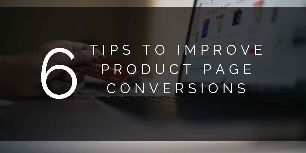
6 Tips to Improve Product Page Conversions
When it comes to a product page, you need to strike the right balance between design aesthetics and conversion factors. Yes, you want the page to pop. It needs to stand out.
You can even include some design factors that will influence conversion, but too many multichannel ecommerce companies focus too much on design and not on conversion. This leads to reduced success and profitability as you fail to acquire new customers. In this guide, we’ll walk you through six important tips to help improve product page conversion.
-
Image Quality and Multiple Angles
It’s tempting to just throw whatever image you have on hand up on your product page.
As long as it looks OK, it should be fine, right?
Wrong.
Your customers should be able to expand the image to see your product’s fine details, so make sure that you use high-quality imagery. You also want to supply pictures of the product from multiple angles so your buyers can get a decent observation of the product before they buy.
When you provide multiple photos from different angles, the customer feels like you are giving them all necessary information to make an informed purchasing decision.
Further, depending on your industry you should include photos that help customers approximate size ratios (yes, you’ll give specifics in the descriptions, but when you selling jewelry, it’s nice for them to see a photo of someone wearing it).
Remember that you’re trying to approximate the experience of buying in person, so great visuals matter a lot.
-
Your Call to Action (CTA)
If you have a product page that isn’t performing to your expectations, it might not be the imagery or the description. Your call to action is probably lacking. The buy it now or add to cart button needs to be prominently featured so that your buyer cannot overlook it. Make sure your design doesn’t put any clutter around the button that might distract your buyer.
You might also consider placing the button directly below the item description, particularly if you conclude the description by urging your customers to “buy it now”.
You should experiment with different colors and phrases for your Call to Action as these can make a major difference in the visibility of CTA.
Specifically go for a color that is in contrast to the rest of your page, while this might change your design, you can choose a color that still matches your theme while getting a buyer’s attention. Red, orange and green tend to be great colors for CTAs but you really want to test them to see which do best with your customers and your design. Browse our , with a variety of options to suit every taste and budget, available to buy online.
This isn’t any different when you sell on a marketplace like eBay. While the buy button is at the top, you can create a link to scroll back to the top of the page from a Buy Now button in your description. It’s important to remind people to buy your product at multiple points in your eBay or Amazon marketplace description.
-
Create More Detailed Descriptions for Higher-Priced Items
It’s easy to gloss over descriptions of your items on your product page and default to using manufacturer details. But, this is a big mistake because your descriptions are one place you can truly over deliver, earn customers, and impress search engines to get more traffic.
In fact, some sites are known for their unique descriptions, such as Woot and Grommet. Both of these sites use their unique styles as part of their brand. Woot has silly descriptions that include calls to actions to get visitors to buy.
It pays to take the time to write a description that is interesting and gives visitors all of the information they need to make a purchase. This is especially true when you sell higher-priced items. Potential buyers want all of the information they can get to reinforce their decision to buy.
One way to improve your descriptions is to visit your competitors’ items and see what they are doing differently. You can also look at any online store with items priced similarly to your own.
What you are looking for are entertaining, educational, details that contribute to the overall buying experience. Details like awards, celebrity endorsements, popularity, instructions or manuals, videos of people using your product or unique information about why this product is better than a similar item will add to the value of your description.
-
Reduce Clutter
Visitors to your product page expect to immediately see your product and the pertinent information that for making a purchase. But we often overlook their expectations in favor of adding features that do not add to the experience.
For example, sliders, large headers, excessive menus, or advanced search options often take up space above the fold that keeps buyers from seeing the product. Get rid of these.
It’s good to have category pages, but product pages should feature the products themselves along with titles, descriptions, photos, and selection options.
Of course, with a lot of marketplaces like eBay and Amazon you won’t have much control over this, you can make sure your descriptions are clean and easy to read.
-
Include Your Branding
If you have a product that is not selling well, it could be a lack of identity. Is your branding present on the page? By this we mean more than just your logo. You need to maintain a cohesive brand across all of your online outlets, with the same voice and style used throughout.
A buyer finding your product page on Amazon should experience the same brand identity as one finding the product on your owned website. If this is not the case, then you have your work cut out for you. You also need to make sure that the brand threads you’re weaving into the product page communicates clearly to your buyer what your company is all about.
Are you eco-friendly? Designer focused? Budget-friendly? You get the idea.
-
Give Them the Information They Want
Your page conversions might be languishing because you don’t provide your customers with the information they need. This goes beyond the product description and price.
They need to know a few other key factors – how many are in stock? What’s the rating shown on your product page? How many customer reviews are there? When will the product ship and what is the estimated delivery time? How much is shipping?
These are just a few of the things that your customers will need to know before buying, and giving that information upfront will make them likely to convert to buyers.
Again, with being on certain marketplaces you may not be able to control where you put all of your details, but you can make sure these details are included with templates on eBay and prominently by choosing the right options on Amazon.
Ultimately, product page conversion can be tricky to master, but the tips we’ve laid out above should help your multichannel ecommerce company find better success.
Source:
https://www.hellobar.com/blog/ecommerce-optimization/
https://thenextscoop.com/optimize-product-page/
https://www.crazyegg.com/blog/optimize-your-product-pages/

